Eco Chic (as a UX|UI designer)
Design of an adaptive rental fashion website
Designing a sustainable rental fashion website was one of my most exciting assignments as a student at UXland School. Our goal was to make it work well on both phones and computers with a focus on user-friendly design. This project aimed to merge sustainability with luxury fashion, promoting the concept of Renting fashion instead of Purchasing it. Since this project was part of a school assignment, we started off by imagining a stakeholder, keeping their needs and limits in mind while designing. As the lead designer, my role was to ensure the platform was intuitive, facilitating easy access to high-end fashion.
Here is a sample mockup displaying a part of this design. Scroll down to read more, or click the button to view the complete Figma prototype.
Project Overview
Business Needs
Creating a website with an appealing user experience to rent luxury clothes and bridal dresses online.
Goals
Simplify the luxury clothing rental process with an intuitive interface.
Introduce virtual try-on for accurate fitting and increased satisfaction.
Incorporate subscription options for enhanced access and convenience.
Duration
Team
Role
Tools

12 weeks-part time
Group of 5
UX/UI Designer
Figma, Photoshop, Google Form, Zoom
Design Process
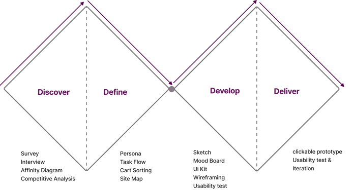
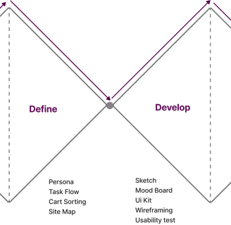
Our team of 5 ran a Double Diamond Design based on the Design Thinking Methodology. It was not a linear path, and we bounced between stages as the project progressed.
Discover
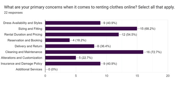
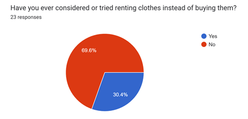
At first, we started with a survey to get a general idea of people's needs and challenges in renting clothes. The results of the study show:
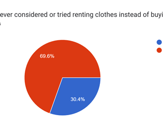
A significant portion of respondents have never experienced renting clothes. So, our design should focus on simplifying the rental process.
Cleanliness and hygiene emerge as top priorities for potential renters. So, we must reassure users about the cleanliness and hygiene standards of the clothing.
Accurate sizing and fitting are crucial for customer satisfaction in clothing rental. So, the interface should prioritize helping users find their perfect fit by implementing advanced size recommendation tools.
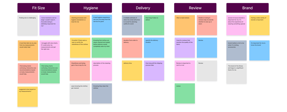
User interview and Affinity diagram
Competitive Analysis
They prefer alternative solutions instead of size charts.
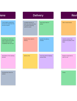
Hygiene matters for users, and they need to be ensured about the cleanness of products.
They need to know, in advance, how long it takes for them to received their orders.
They normally prefer to read the reviews of previous users before renting a product.
They prefer to know the brands that are available to rent, especially in accessory line of products.
We did a competitive and comparative analysis by looking at websites that have relatively similar business models or selling fashion products online, identifying their features, and also getting ideas from them. Here are some of the results:

We have gained ideas on how to design our user flow from websites that offer both subscription and one-time rental options.
We have learned from websites with fit-size tools and virtual try-on features about the best ways to incorporate them into our flow.
Based on the results of the survey, we found our potential users to interview, during which we were able to ask them open-ended questions and get more details about renting fashion. After talking to 9 people, we created an affinity diagram.
Affinity Diagram Takeaways
Competitive Analysis Takeaways
Survey


Define
Persona
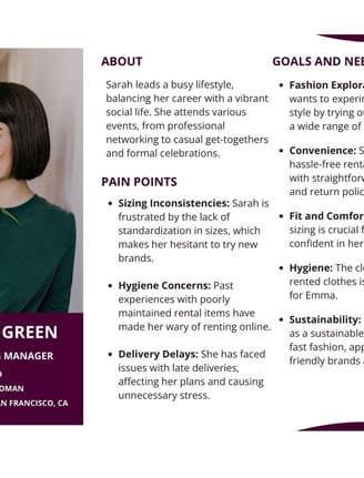
As a result of the research, our team created a persona to communicate information about a potential user, Sarah, her needs, and preferences, which will guide the design.
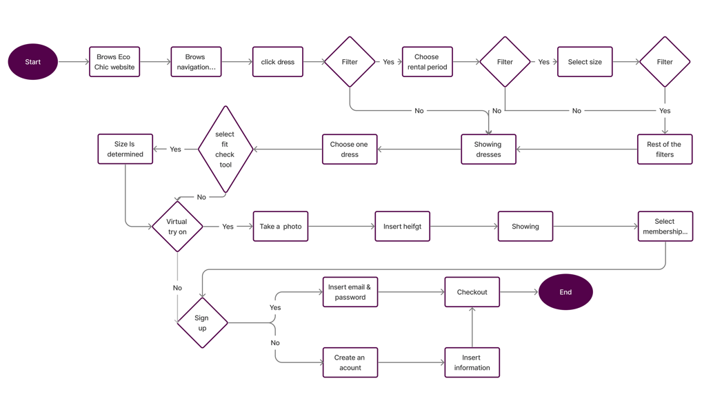
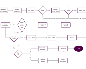
User Flow
Site Map
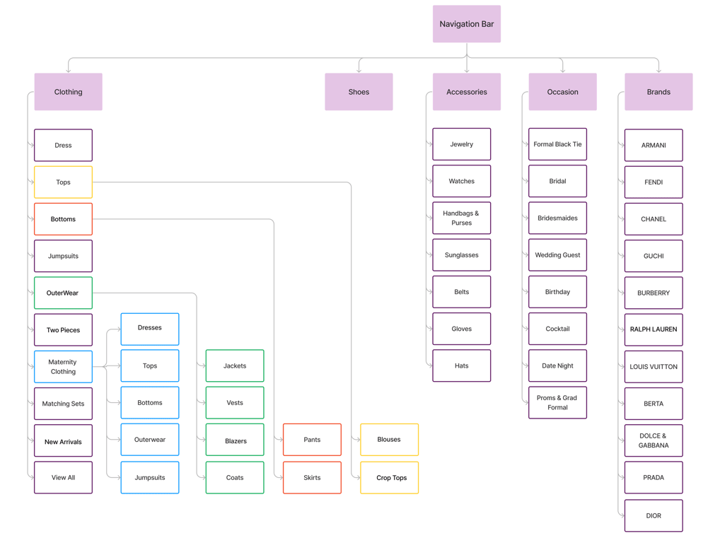
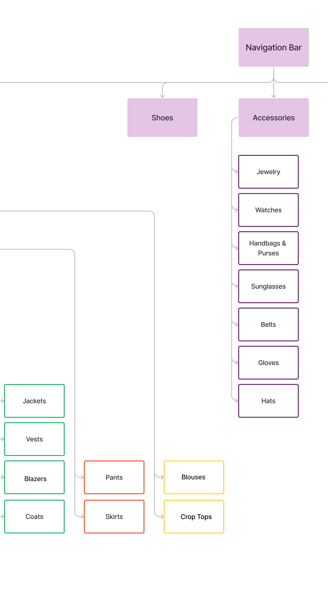
We created the initial version of our information architecture from card sorting. As we progressed through the design process, user testing, and analyzing competitors, we developed the final version.
Develop
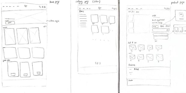
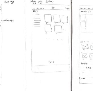
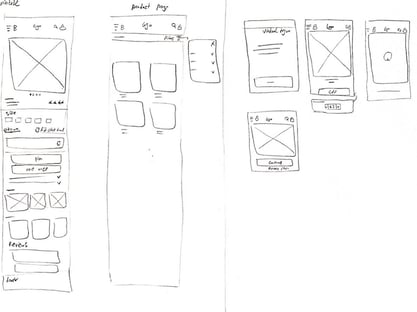
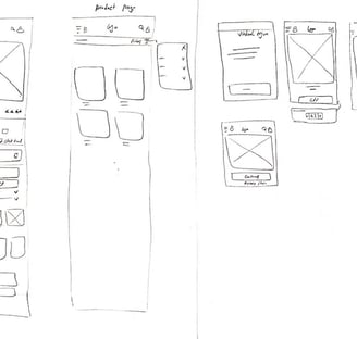
Sketch and Wire Framing
Based on the information we received during our research, we started to design with hand sketching to map out our ideas, which helped us in the early stages of the design to go forward and have better communication with the team.


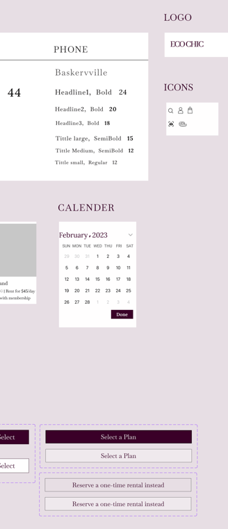
UI Kit
Mood Board
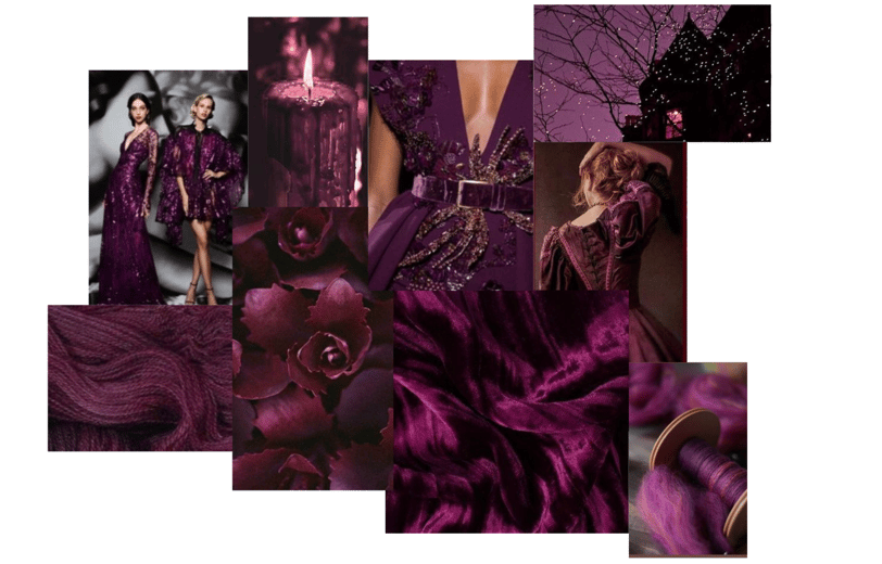
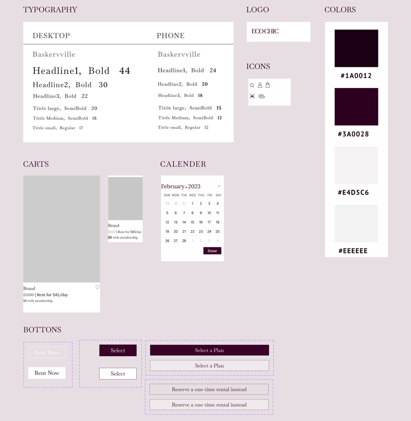
We chose purple to convey a sense of luxury and exclusivity. This rich, deep hue often associated with royalty and sophistication, enhances the aesthetic appeal and is suitable for our luxurious rental fashion website.
Challenges and Solutions
Challenges
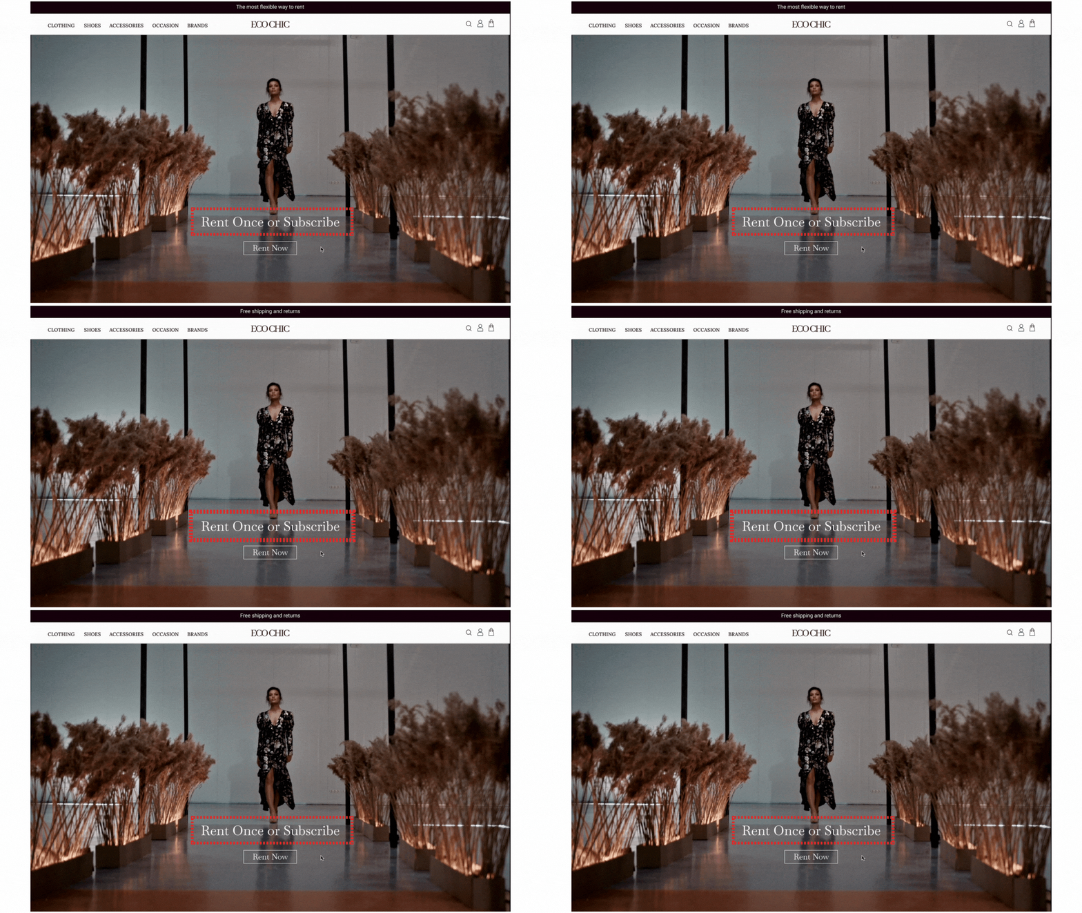

Highlighting our subscription and one-time rental options.
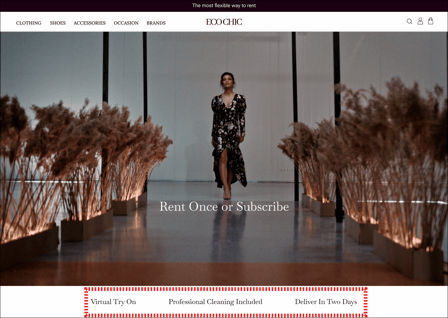
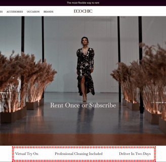
Displaying a clear slogan on the hero image to indicate that we offer both options
Addressing the users' main concerns about renting fashion.
Showcasing Virtual Try-On, Hygiene, and Fast Delivery as features on our website, highlighted in three clear phrases under the hero image.
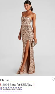
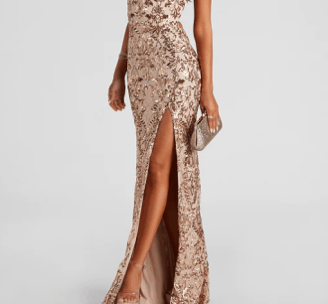
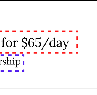
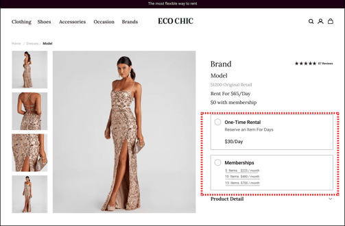
Educating users on how our two rental options function (subscription and one-time rental)
Including clear descriptions under the product cards that explain that subscribers can rent items at no additional cost, whereas non-subscribers pay based on the rental duration.
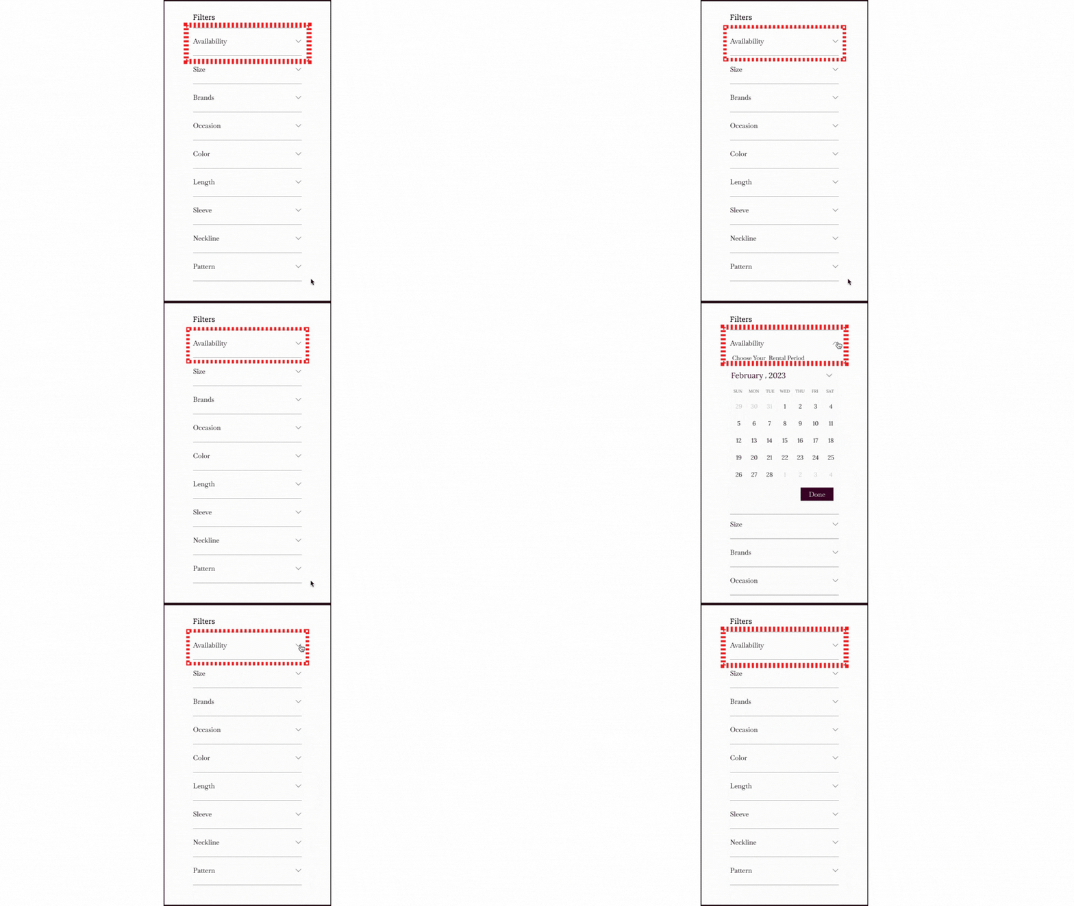
Ensuring users can easily know the availability of products.
Positioning 'Availability' as the foremost filter option to enhance visibility and user convenience in product searches.
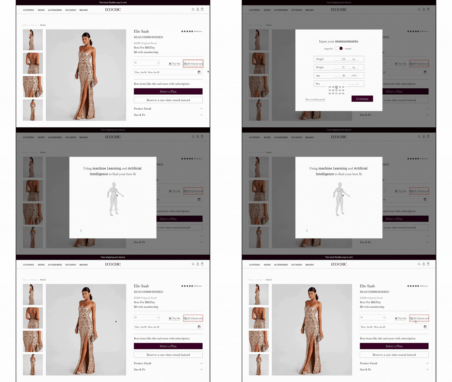
Simplifying the decision-making process for users by reducing the uncertainty around size selection.
Implementing a fit-check tool that suggests the appropriate size based on the user’s body measurements.


Solutions

Testing
A/B Testing
Usability Test
We conducted usability testing to assess the immediate comprehensibility of our business concept as presented on the homepage. The test focused on the hero image and the accompanying slogan.




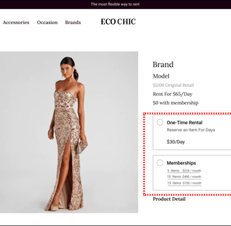
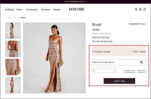
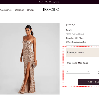
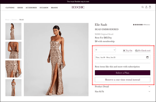
To determine the most user-friendly product page layout that maximizes engagement and conversion rates.We conducted an A/B test with two different designs of our product page:
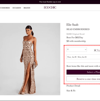
Version A: Users are prompted to select their renting plan (one-time rental vs. subscription) before accessing the fit-check tool and virtual try-on features.
Version B: All options, including the renting plan selection, fit-check tool, and virtual try-on, are available simultaneously from the beginning of the user journey.
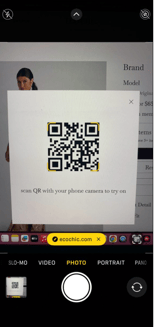
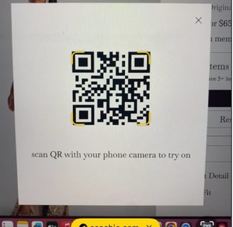
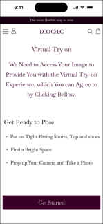
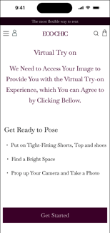
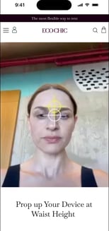
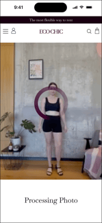
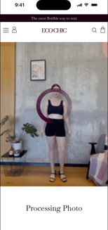
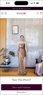
We conducted usability testing to assess the ease of use, functionality, and user satisfaction with our virtual try-on feature, which allows users to see how products look on them through augmented reality technology.
The feedbacks from the usability test was overwhelmingly positive. Participants found the virtual try-on feature intuitive and enjoyable.
Based on the feedbacks, we concluded that the hero image and slogan effectively communicated our key services, confirming the effectiveness of our homepage design.
Version A
Version B
Deliver
Iteration
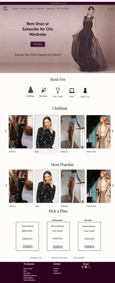
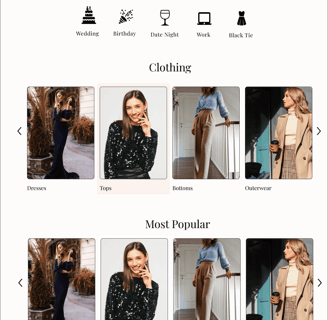

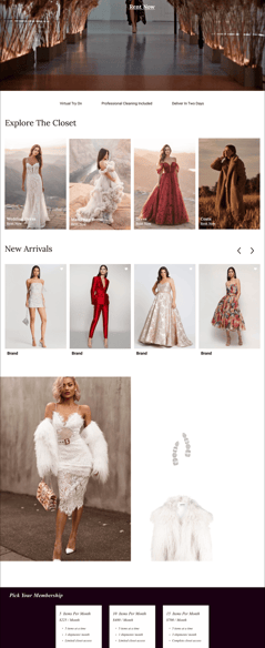

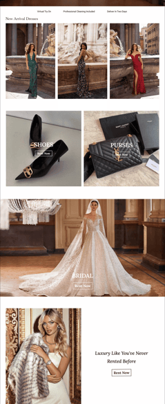

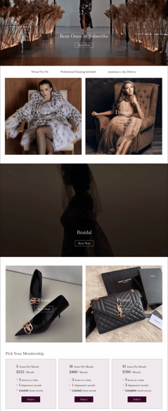
Home page layout and design went through several iterations until the latest version agreed.

Final
We have made quality of our habit. It’s not something that we just strive for – we live by this principle every day.
Final Prototype
In this section, you can check out the complete final prototype.
Reflection
What I have learned from this project
In this project, I have learned the importance of research in all stages of the design process and how it can improve a product.
I learned that testing and iteration can really make the product more user-friendly and acceptable.
I learned developing a UI kit brings a consistent design and makes communication easier between colleagues. Also, further modification of the product seems easier.
What I can do next
improving the accessibility of the pages to make them usable for more users.


